Design Schemes for Tree Weaves Stairwell Sculpture
A comprehensive list of ideas and their corresponding colors
Rainbow
Level-Coordinated Colors
Multi-tonal
Solid Colors
Monochromatic
1. Rainbow
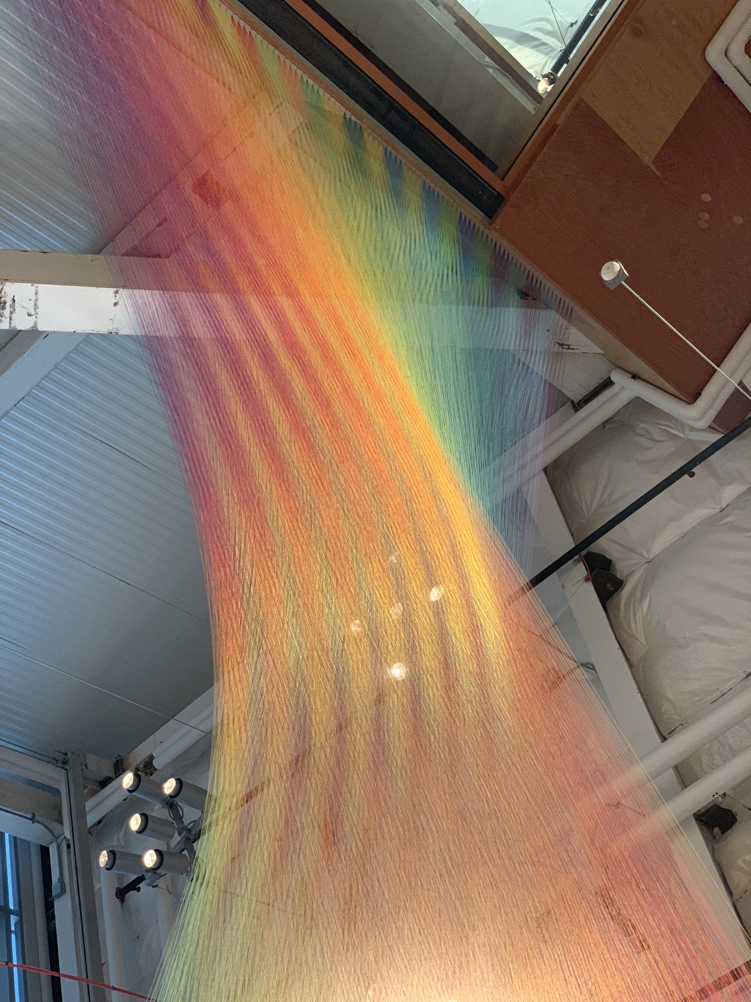
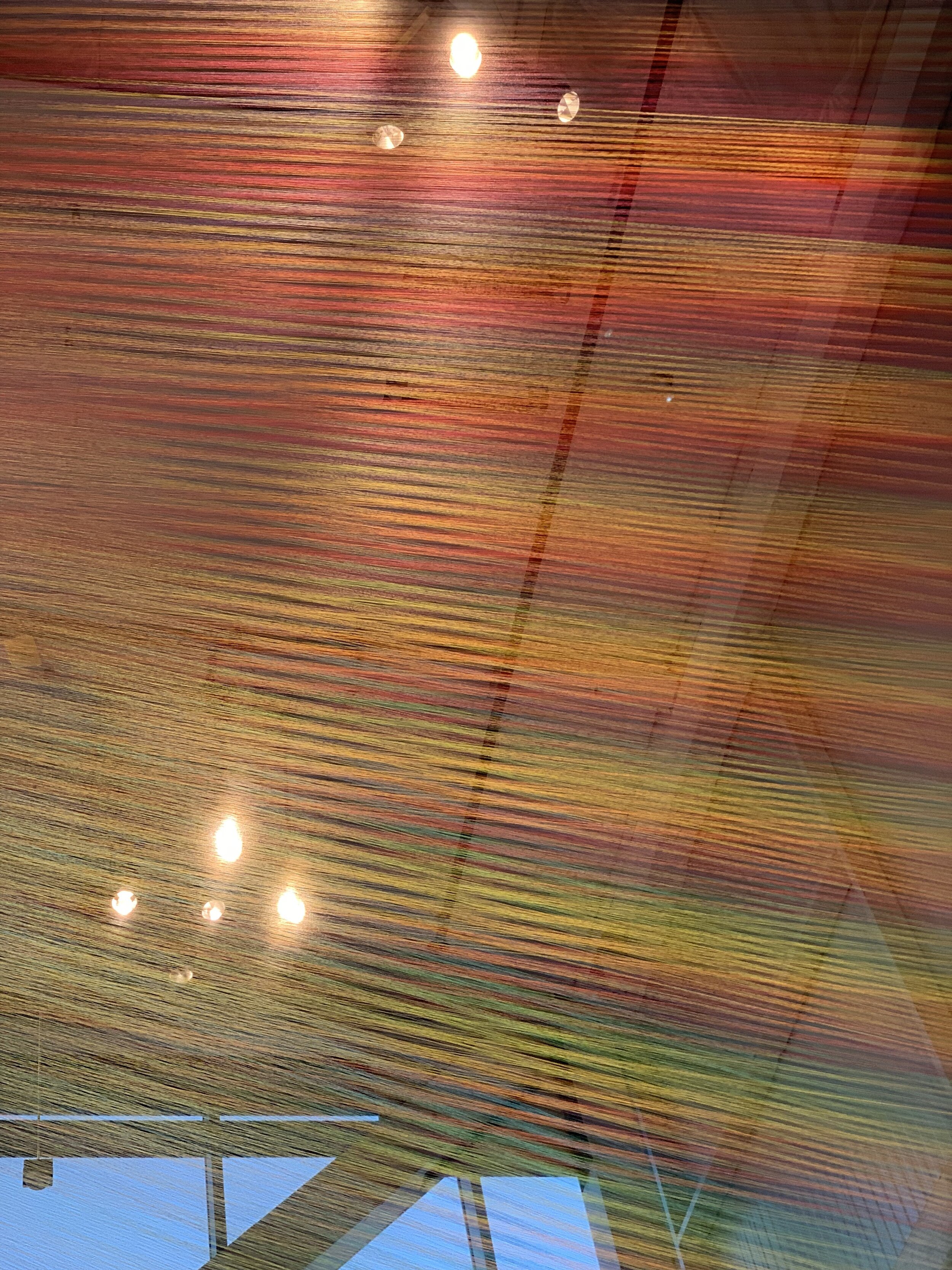
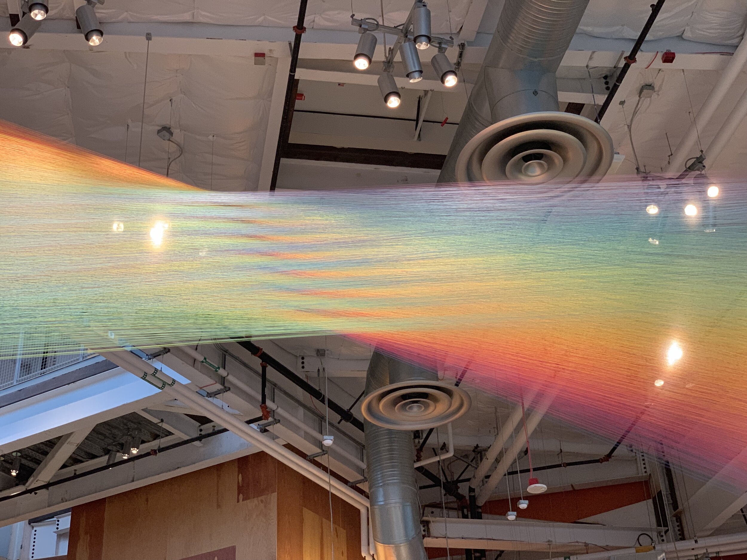
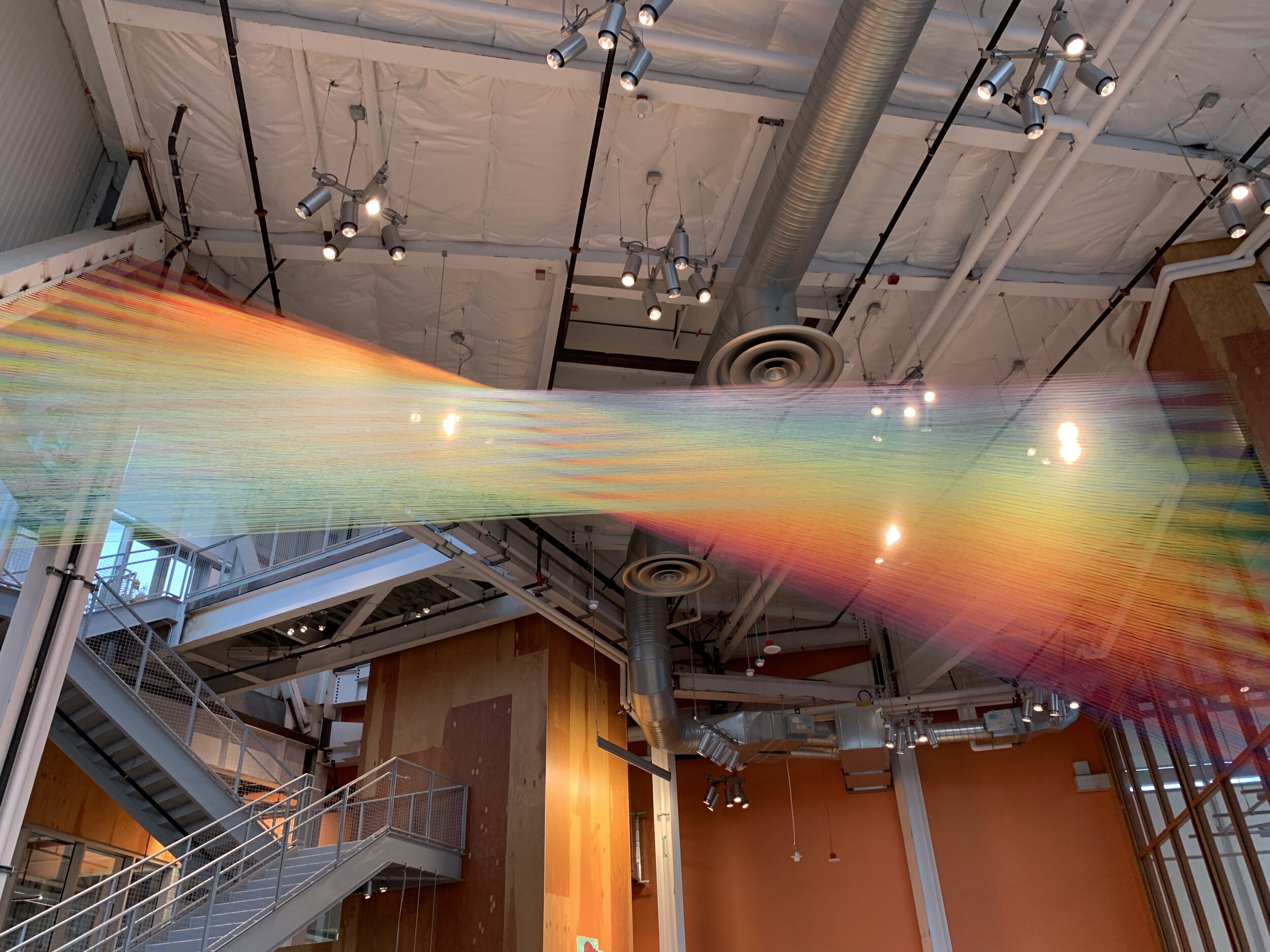
A rainbow Sculpture would be the most artistic, creative, and beautiful option we have to offer. We are confident that we can execute an excellent rainbow gradient across the 5 floors of the stairwell that looks professional, groundbreaking, and stunning. We think having a rainbow (or 5 rainbows) going up the stairwell would be the most satisfying and intriguing installation possible. It also carries strong symbolism.
Transitions will alternate shades to make the gradient look more natural.
For each color in the spectrum we can use 2-5 shades of each color (our preference) or we can just use a single solid color for that color (i.e. Kelly Green for the Green section).
We have allocated these colors approximately across the floors, with Red on the bottom and Violet at the top, although this could be inverted. The pattern could also be done as a spiraling rainbow where each color of the spectrum is expressed evenly across each level, although we believe spreading one spectrum out across all the levels will be the cleanest and most impactful expression of this idea across this scale.
Inspiration
Our main inspiration for this design comes from an art installation we saw on the Facebook campus in Menlo Park. We do not know the name of the artist, but below are our photos and videos of the piece. This piece was non structural and intricately strung up with what looked like sewing thread.
Our Color Choices for the Rainbow Spectrum
RED

Burgundy
Burgundy is a color we have no personal experience with but we think it could work well as one of the colors in the red spectrum

Imperial Red
Imperial is the most “Red” shade of red available. Classic. Holds color well.

Scarlet Red
Scarlet is barely distinguishable from Imperial red, it is just a little brighter

Crimson
A matte, dark and saturated shade of Red

Imperial Red IRL
In the Woodstock NY Tree Weave

Scarlet in the Camelback Tree Weave
on a swing in Austin Texas

Crimson in Real Life (IRL)
This is in one of our Washington installations
ORANGE

Mustard
Mustard is a shade of orange that we do not have experience with, but we think it’s worth considering for the orange spectrum

Burnt Orange
Another shade of orange that we haven’t experienced, but we think it will go well

Solar Orange
Solar Orange is a bright, bold shade of orange that actually looks quite good.

Orange
Although it doesn’t look true in this image, “Orange” is the truest, best shade of orange.

Solar Orange in the Cocoon Tribeca
New York, New York

Orange in the Picnic Basket Tree Weave
in Asheville NC
YELLOW

Goldenrod
A really beautiful, deep golden shade of yellow

Marigold
A rough, canvassy shade of yellow that looks nice

FS Yellow
FS Yellow is the truest shade of yellow that is the deepest saturation and holds its color the best.

Goldenrod in Dome Town Tree Weave
Eco Resort in Red River Gorge, Kentucky

Marigold in the Cottonbowl Tree Weave
A grandmothers net in Boulder Colorado

FS Yellow in the Quilt Portable Spacenet
For true yellow, this is the only option
GREEN

Emerald Green
A beautiful shade of dark, deep green

Fern
The green used in the Lobby Net feature at GDS

Kelly Green
The truest “Green” green

Teal
A greenish shade of blue

Kelly Green in the Quilt
In a portable spacenet


Teal in the UES Penthouse Loft Weave
Teal side by side with Caribbean
BLUE

Caribbean Blue
A deep, beautiful teal shade. Almost indistinguishable from Teal side by side, but to a trained eye, Caribbean is brighter and bluer than Teal. They will transition from green to blue nicely together.

Colonial Blue
Just a nice shade of lighter blue

Electric Blue
The truest shade of “Blue” blue

Midnight Blue
The best shade of Navy Blue

Caribbean in a Loft Weave
Here Caribbean and Teal are side by side, but with the colors drastically enhanced to show their contrast. To the naked eye they are much closer in color.

Colonial Blue in the Camelback Tree Weave
In Austin, Texas

Electric Blue in the quilt Spacenet
The bluest blue

Midnight Blue in a loft net
In the Upper East Side
PURPLE

Lavender
A bit of a bluer purple

Acid Purple
The most “purple” shade of Purple around

Purple
Lighter purple

Multiple Shades of purple blended
In the Purple Palace Tree Weave

Lilac
The pinkest purple
2. Level-Coordinated Colors
Multi Tone
For a multi-tonal level-coordinated motif we would recommend the same spectrum as above for the respective colors of the rainbow, green, blue, yellow, orange, as pertains to the floors.
Solid Tones
Green —Kelly or Fern. Kelly is true green, but Fern matches the lobby net.
Blue — Electric Blue (true blue), Caribbean, or Colonial.
Orange — Orange.
Yellow— FS Yellow
3. Monochromatic
A monochromatic color option would be the least striking, least creative option available. There will be no price break or labor savings for making this sculpture monochromatic.
based on our experience, we recommend these color options for a monochromatic stairwell sculpture:
Caribbean
Acid Purple
Midnight Blue